

Biotech web design: what a science website has to do
How to build a biotech website that scientists trust and buyers act on: structure, claims, design, AI search and realistic timelines, with lessons from our own website projects.

64% of scientists look at vendor websites when they are ready to buy, and 79% compare only two or three vendors. Biotech web design decides whether you make that list.
________________________________________________________________________________________________________________
Biotech web design starts with a harder brief than most websites get. The same page has to convince a scientist who reads every footnote and give a buyer with a budget an obvious next step. Sites built from a generic template rarely manage both.
This guide collects what we have learned building and rebuilding websites for biotech, medtech and life science tools companies at Ooho. It covers structure, claims, design, AI search and the project mistakes we now plan around. The examples come from our own client work and project meetings, including two published case studies. If you are rethinking more than the website, start with our guide to digital marketing for life sciences.
What makes biotech web design different
Biotech buyers decide in groups, and they take their time. A scientist evaluates the method, a lab manager checks the workflow, procurement compares terms and a finance lead signs off. Each of them visits the same website looking for something different.
Most of that research happens before anyone talks to your sales team. In a Gartner survey of 632 B2B buyers, 61% said they prefer to buy without a sales rep. And 69% had found inconsistencies between a supplier's website and what its sellers told them.
Scientists behave the same way. Biocompare's Inside the Lab survey asked more than 575 life scientists in 2026 where they look when they are ready to buy. Vendor websites topped the list at 64%, ahead of web search at 61%. And 79% compare only two or three vendors before deciding, so the website has to earn a place on a very short list.
Three things follow for the design. Proof carries more weight than polish, because scientists read the data, the publications and the fine print. The site has to hold up over months of repeat visits, so evidence and resources matter as much as the homepage. And many claims are regulated, with different limits in Europe and the US.
That is why a SaaS template struggles in life sciences. It sells features in the first scroll and asks for a demo before it has shown any evidence. A biotech site earns the right to ask.
The basic structure is no secret. When we reviewed the top 100 medtech websites, about 80% followed the same layout. The good ones stand out for what sits inside it: a one-line answer to what you do, proof beside every claim and a route for each audience. So we keep the structure conventional and put the effort into the story.
Write one site for scientists and for buyers
Most life science companies sell to a buying group, and each member arrives with a different question. We cover how that group decides in our article on medtech positioning for the US market. On the website, the answer is one site with layers, and three rules keep those layers in order.
Pass the five-second test, then let the science open up
A visitor should know what you do within five seconds of landing. That includes the hospital administrator and the finance manager, who read the homepage too. If the hero fails that test, nothing below it gets read.
The research agrees. People judge a web page's visual appeal within 50 milliseconds, and visitors commonly leave a page within 10 to 20 seconds unless its value proposition is clear.
So the homepage does the brand job: what you do, for whom and why it matters. Product detail and clinical numbers live one level deeper, where the people who need them go looking. On one CRO site, a rotating slider in the hero showed one service at a time. Visitors who landed on the viral vector slide took a broad CRO for a viral vector specialist. The fix was one hero line that says what the whole company does.
Give each audience its own way in
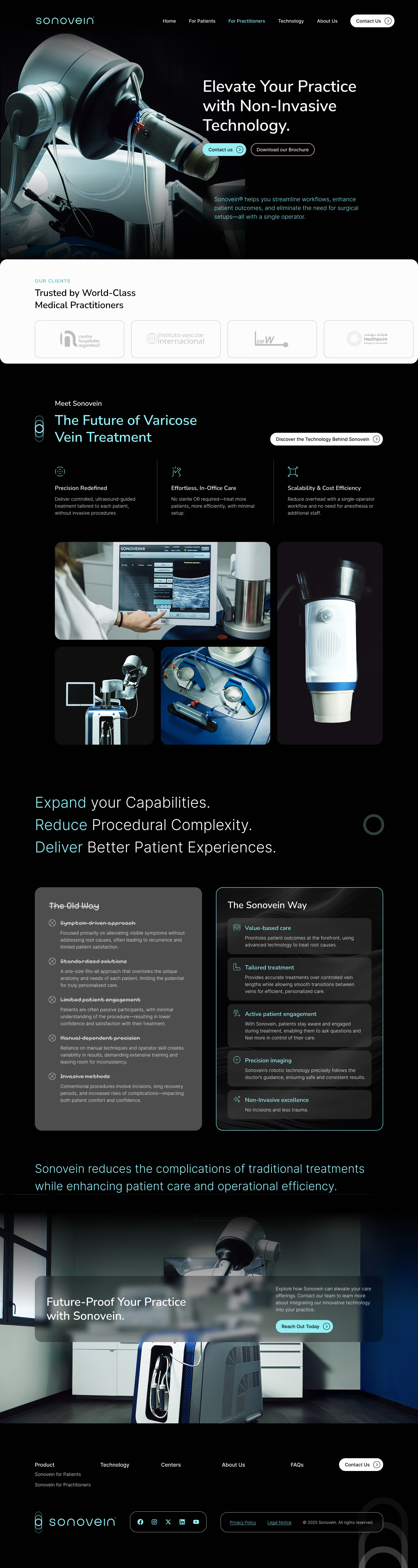
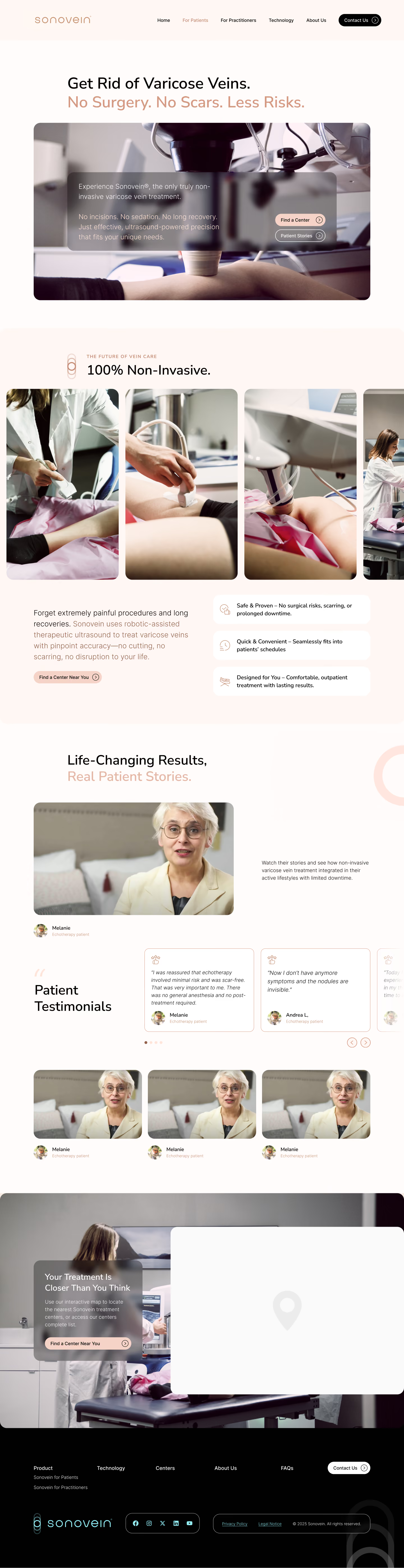
Split by role or by application inside one site. A separate microsite per audience adds upkeep and splits your search authority. On the Sonovein website, vascular specialists and patients each get their own route from the homepage. For a pre-launch medical device, we turned an internal “HCP page” into a public Science page for doctors, pharmacists and parents, with claims kept out of the headlines.
Put the evidence where the claim is made
Every claim gets its proof in the same section: the data, the publication, the poster or the KOL quote. A science card that says where the work was presented reads as evidence. The same card without a source reads as marketing copy.
Scientists do check. In Biocompare's survey, 67% read peer-reviewed articles regularly, and 65% first hear about new products through publications or citations. Literature is the source they trust most, well ahead of video or vendor case studies.
Match each call to action to the page
The homepage can ask “Contact us”, because some visitors already know what they need. Inner pages convert better with a scientific offer, such as a case study, an application note or a webinar. In our accounts, white paper landing pages convert 5 to 10% of their visitors. Keep the form short, and ask your compliance team which consent text is required. On one site we cut 15 lines of consent copy down to the legal minimum, and the form worked better for it.
Make contact easy, too. 61% of scientists prefer to deal with vendors by email, text or chat, and only 12% prefer phone calls or demos. Free samples or trials are the offer most likely to sway a purchase, named by 67%. So give “Book a demo” a lighter alternative, such as a short form or chat, and offer a sample or trial where you can.
Structure a life science website around how people buy
A buyer moves through four questions: what is it, does it fit my application, can I trust it and who do I talk to. A life science website that follows that order needs six top-level sections: platform or products, applications, evidence, resources, company and contact.
Four rules keep that structure clean as the site grows:
- Keep the top menu short and in your buyers' words. Use the terms they search for and say out loud at conferences, and leave internal product codes out of the menu.
- Give a topic its own page only when it has earned one. It needs separate search demand and enough material to fill a page. Otherwise it becomes a section on its parent page. A keyword can own a section without owning a URL.
- Keep services, applications and therapeutic areas in separate menus. Mixed into one list, they confuse visitors, and the confusion grows with every page you add.
- Plan for pages you have not written yet. Design the template for future case studies or technology pages now, and keep it hidden until the content exists.
In Koen's experience, most sites end up with about five standard pages and about five that are unique to the business. The standard ones follow convention. The unique ones carry your positioning, so that is where the writing time goes.
Match each product line to how it is bought. Biocompare found that 83% of reagent and kit purchases happen within a week of finding the product, while 20% of instrument purchases take six months or more. Reagent pages need a fast route to reorder. Instrument pages need the specs, comparisons and proof a buyer uses to build an internal business case.
Design for scientists: what our creative director has learned
Koen Schoofs, Ooho's creative director, has presented website designs to proteomics, bioprocessing, organ-on-chip, health data and multiomics companies. The same handful of rules comes up in every review.
Design carries credibility with this audience. In Stanford's study of 2,684 people judging websites, the design look came up in 46.1% of comments about credibility, more than any other factor.
Keep it clean, then add one touch of character
“As simple and as clean as possible, but also give it a little bit of care,” Koen says. Scientific audiences reward clarity, so the layout stays plain. The character comes from one or two brand elements, such as a background texture or a gradient, so the site does not look like its competitors.
Use dark and light sections on purpose
A dark hero pulls the reader in, Koen says. Content that has to be read and understood, such as a workflow, a comparison or a data table, sits on a light background. Alternating the two also breaks up long pages, so the reader keeps going.
Let the science set the colours and the motion
Colour choices start with contrast. WCAG 2.2 sets a minimum contrast ratio of 4.5:1 for body text, so on a dark background the brand colour with the best contrast carries the text. Some colours already have a meaning. Red reads as a problem, so we use it for pain points. On one multiomics site, the client's product team already used two fixed colours for two DNA modifications, so the hero palette had to follow them.
Motion has to match the mechanism. On a bioprocessing site, a circling animation suggested agitation, while the client's technology works by perfusion. The client spotted it in the first review. We kept the circles only where they showed the applications around the technology.
Make every click obvious
On an organ-on-chip site, visitors missed that “Services” opened more pages, so it became a mega menu with icons. Usability research backs the pattern: a mega menu shows every option at once and groups related pages visibly. On the same site, Koen pushed for “Explore our organ models” over “Get started”, because it tells a first-time visitor what happens next.
Tabs are “notoriously difficult for mobile”, Koen says, so long lists become cards that expand on click. When in doubt, take decoration out: “Oftentimes, simplicity just works best.”
Design for the desk first. In Biocompare's survey, 94% of scientists read scientific content mostly on a laptop or desktop, and only 4% on a phone. Every page still has to work on mobile, but the big-screen layout is where the decision gets made.
Good design also depends on good assets. A full-width hero video needs about 2,000 pixels of width, a 16:9 crop and a dark overlay so the text stays readable. A clean phone photo of the real product against a white wall beats a 3D render with visible errors.
Claims, compliance and regulated markets
Regulators treat a website as advertising, so every claim on it follows the same rules as a brochure. Those rules differ by market, and they shape the copy more than most teams expect.
In Europe, Article 7 of the Medical Device Regulation bans text, names and pictures that mislead about a device's intended purpose, safety or performance. That includes suggesting uses outside the intended purpose that the conformity assessment covered.
In the US, a device that went through 510(k) is described as “FDA cleared”. Calling it “FDA approved” is misbranding under 21 CFR 807.97, which treats any impression of official approval as misleading. An investigational device cannot be promoted at all until FDA allows commercial distribution (21 CFR 812.7). Research tools carry their own line: “For Research Use Only. Not for use in diagnostic procedures.” (21 CFR 809.10).
Medicines face a stricter line again. EU law bans advertising prescription-only medicines to the general public (Directive 2001/83/EC, Article 88), so therapeutics companies keep product information for healthcare professionals.
In practice, four habits keep a site out of trouble:
- Write each claim from the intended purpose or the cleared indication, and link the evidence beside it.
- Keep a claim out of the headline when its proof needs a qualifier. On one site, a comparison figure got an asterisk because the study behind it compared breastfeeding with bottle feeding in general, without testing the product itself.
- Put detailed regulatory information in an FAQ or a regulatory page, where the people who need it look for it.
- Book the regulatory review into the copy phase, before design starts.
Two more rules apply to almost every European site. Cookie banners need a reject button on the first layer and no pre-ticked boxes, according to the EDPB cookie banner taskforce. The European Accessibility Act has applied since 28 June 2025, but it covers consumer-facing products and services. A site that sells only to businesses falls largely outside it, while patient pages and online shops may not. None of this is legal advice, and your regulatory team has the final word.
Medical device website design: what changes
Medical device website design adds a second audience with its own rules. Clinicians want clinical evidence, workflow fit and training. Patients want to know what the treatment feels like and where to get it. Hospital buyers want pricing, reimbursement and service terms.
Give clinicians and patients separate routes from the homepage, each in its own language. National rules on advertising devices to the public vary across Europe, so many device sites put detailed clinical content behind a “for healthcare professionals” confirmation. Your regulatory team decides where that line falls for each market.
Selling in Europe and the US from one site takes extra care. One US medical device company needed an EU version of its homepage with the promotional sections removed. Webflow's built-in locale routing follows the browser's language setting, which says little about where a visitor sits. So the build combined Webflow localisation for the content with a third-party tool that routes visitors by IP address.
Make the site readable for AI search
Buyers now research vendors with AI. In a Gartner survey of 645 B2B buyers published in May 2026, 45% had used generative AI, mainly to gather information on vendors and products.
Those AI answers lead back to your website. Among scientists who use AI, 73% go straight to the vendor's website after an AI recommendation, and only 4% buy on the recommendation alone. Three in four say an AI recommendation is more trustworthy when it cites specific published studies or data, so put those studies on your pages.
For one medtech client we tracked 80 to 90 keywords. Between 60 and 70 of them already showed an AI Overview, and no competitor was cited in any of them. Those citations were there for the taking.
AI engines split a buyer's question into sub-queries and cite the passages that answer one of them cleanly. Five build decisions make your pages easy to cite:
- One question per section. Each H2 or H3 answers one thing a buyer asks, in the first sentence below it.
- Titles that say what the page answers. In an Ahrefs study of 1.4 million ChatGPT prompts, how closely a page title matched the question was the strongest predictor of a citation.
- Structured data that matches the page. Mark up the organisation, the products and the FAQ. Google says AI Overviews need no special markup, and it stopped showing FAQ rich results in May 2026. Treat schema as hygiene that helps engines read the page.
- Key text in HTML. Text locked inside an image or a video is invisible to crawlers. On the Spentys case study, we rebuilt five static graphics as animated HTML, so every number in them can be read and quoted.
- Fast, crawlable pages. None of the major AI crawlers from OpenAI, Anthropic or Perplexity run JavaScript, so content that only appears after a script runs stays invisible to them.
Title tags, entity schema and a copy rewrite took one CDMO from 21% to 44% AI visibility in seven weeks, measured on 18 buyer prompts across four AI engines. Our guide to AI search visibility for life sciences covers the full method and how to measure it.
How a biotech website project runs, and where it slips
A simple biotech website takes about three months from a signed-off brand to launch. A larger site, with more pages, products and audiences, takes about six months. Complex programmes can take twelve.
For a simple site, those three months cover four weeks of content and copy with two client review rounds, then three weeks of visual design and three of build. QA and staging review take a week each. A new or refreshed brand adds about six weeks before that.
Content, reviews and markets decide where a project lands. Every extra page needs writing and approval, every extra reviewer adds a round, and every new market adds claims to check and pages to localise. The copy for one 80-page services site was planned at about four months on its own. A medtech brand and website project with a large review group ran past six months once internal reviews stalled.
Our process runs in seven steps: discovery and content audit, content blueprint, messaging wireframe, an internal wireframing workshop, design, development and final review. The client signs off the messaging wireframe, the design and the build. In our projects, the plan breaks at five predictable points.
Content arrives late, or was never scoped
“For every single website project that we do, 95% of these things always come up, and about 50% at least of those come up way too late,” Koen says. He means logo files, product photos, publication lists and form links. A discovery checklist collects them in week one, along with an audit of what already exists: landing pages, white papers, congress posters and videos.
The copy for a page should be about 95% final before that page goes into design, because late copy changes break layouts. So write content into the scope, and name who writes every word. When the client's scientists write first drafts, give them a page template with each section and its purpose. They fill in the substance, and the review goes faster.
The messages are still open
A site cannot be structured around 55 equal proof points. On one project, the first messaging document listed every claim the company makes, without a priority. The client wanted three to five core messages, and every page waited until they were agreed.
Reviews drift
Documents sent round by email for comments stall. Live review sessions with a small group, with an agenda per page, move faster. Log every request in each round and confirm it is closed. Name the final review round in the plan, and say up front that extra rounds cost extra. Book reviewers into calendars before the summer break and the congress season. And ask which deadline is real: on one project, the congress date everyone was racing for turned out to be flexible.
Design waits for the last 10%
“90% of the website can go into development while we keep looking into the last 10%,” Koen says. We run copy, design and build as parallel tracks, page by page: an approved page moves on while the next one is still in review. Once the structure is agreed, iterations happen in Webflow, which is as quick to change as Figma.
Launch day brings surprises
Speed costs visitors. Google found that the chance of a mobile visitor bouncing rises 123% as load time grows from one second to ten. Aim for Google's Core Web Vitals, with the main content visible within 2.5 seconds.
Staging reviews fail on speed and mobile: half-second animation delays, slow menus, portrait photos that fill a phone screen and type that looked fine in Figma. Test CMS lists under load. One client site was rate-limited on launch day because a page loaded too many items at once. Keep publishing on the staging domain until every quote and claim is approved. And agree in the scope who presses publish and when, because a finished site that never goes live helps nobody.
Two medtech websites we rebuilt, and what they show
Lists of the best biotech websites show what good looks like. They rarely explain why a site works. Here are two medtech sites we built: one with search results on the record, and one that solved the two-audience problem.
Spentys: from unranked to #1 on Google
Spentys makes software for digital orthotics and prosthetics. In 2026 we rewrote its site around a new positioning, cut the blog from 105 posts to 43 and ungated 27 assets that had sat behind forms. Between January and May 2026, Spentys went from unranked to #1 on Google for “3D orthotic software”.
The site had carried Spentys' growth before. Between 2019 and 2022, inbound form submissions grew from 281 to 1,351 and website visitors from 12,202 to 42,027. That engine ran on gated assets. In 2026 we opened it up: fewer, stronger pages and 27 assets free to read, so searchers and AI crawlers reach every page. Read the Spentys case study.


Sonovein: one brand, two audiences
Sonovein by Theraclion treats varicose veins with robotic high-intensity focused ultrasound (HIFU), a new treatment category for most of its buyers. The website had to serve vascular specialists, who need clinical evidence, and patients, who need a clear account of treatment and recovery.
We gave each audience its own route under one visual identity. Clinicians get the mechanism, the procedure and the evidence. Patients get treatment and recovery in plain language. A technical illustration and animation system breaks the device and the treatment into clear visual steps, alongside clinical photography and film in real settings. Read the Sonovein case study.
A biotech website checklist
Copy this list into your project plan and tick it off before launch.
Frequently asked questions
What should a biotech website include?
A biotech website needs a one-line answer to what the company does, platform or product pages and a page per application. It also needs an evidence section with data and publications, resources, company information and a clear contact route. Scientists and buyers each need their own way in. Every claim needs its proof beside it, and every page needs one main call to action.
How much does a biotech website cost?
The cost of a biotech website depends on page count, how much content has to be written, custom illustration and animation, CMS complexity and regulatory review. Content is the biggest variable. In one of our proposals, copy for an 80-page services site was scoped at 8 to 12 hours per top-level page and 2 to 3 hours per detail page. That came to about €40,000 to €45,000 for copy alone. [Tom: add Ooho's typical design and build ranges here.]
How long does a biotech website project take?
A simple biotech website takes about three months from a signed-off brand to launch. That is four weeks of content and copy, three of design, three of build and two of QA and staging review. A larger site with more pages and audiences takes about six months. Complex programmes, with several markets or a big content migration, can take twelve. A new brand adds about six weeks before any of these.
How do you design a website for both scientists and buyers?
Build one site in layers. The homepage tells every visitor what you do within five seconds, and deeper pages carry the data, the methods and the publications. Give each audience its own route by role or application, and put the evidence next to every claim.
What regulations apply to a medical device website in Europe and the US?
In Europe, Article 7 of the Medical Device Regulation bans claims that mislead about a device's intended purpose, safety or performance. In the US, 510(k) devices are “FDA cleared”, and investigational devices cannot be promoted before FDA allows commercial distribution. Cookie consent rules apply to European visitors. The European Accessibility Act has applied to consumer-facing products and services since 28 June 2025, which largely leaves out sites that sell only to businesses.
Which platform is best for a life science website: Webflow, WordPress or HubSpot?
We build most life science websites in Webflow, because it gives designers full control, loads fast and lets marketing teams edit pages without a developer. HubSpot CMS fits companies that run their whole marketing stack in HubSpot. WordPress fits teams with in-house developers who need its plugin range. Whatever you choose, connect your forms to your CRM from day one.
Build a website your buyers trust
A biotech website does its job when a scientist trusts what it says and a buyer knows what to do next. Get the messages, the structure and the claims right first, and design and build move fast. Tell us about your next site, and we will show you how we would build it. Start on our contact page.
Sources
- Biocompare: Inside the Lab, a 2027 marketing guide to life scientists, survey of more than 575 scientists, lab managers and purchasing decision-makers, 2026
- Gartner: 61% of B2B buyers prefer a rep-free buying experience, survey of 632 buyers, June 2025
- Gartner: 69% of B2B buyers turn to sales reps to validate AI-generated insights, survey of 645 buyers, May 2026
- Lindgaard et al.: Attention web designers, you have 50 milliseconds to make a good first impression, Behaviour & Information Technology, 2006
- Nielsen Norman Group: How long do users stay on web pages?, 2011
- Fogg et al., Stanford: How do people evaluate a web site's credibility?, 2,684 participants, 2002
- Nielsen Norman Group: Mega menus work well for site navigation, 2017
- W3C: Web Content Accessibility Guidelines (WCAG) 2.2
- Google: Mobile page speed industry benchmarks, 2018
- web.dev: Core Web Vitals
- Google Search Central: AI features and your website
- Ahrefs: Why ChatGPT cites pages, 1.4 million prompts analysed, April 2026
- Vercel: The rise of the AI crawler, December 2024
- Medical Device Regulation (EU) 2017/745, Article 7: Claims
- 21 CFR 807.97: Misbranding by reference to premarket notification
- 21 CFR 812.7: Prohibition of promotion of investigational devices
- 21 CFR 809.10: Labeling for in vitro diagnostic products
- Directive 2001/83/EC on medicinal products for human use
- EDPB: Report of the work undertaken by the cookie banner taskforce, January 2023
- European Commission: European Accessibility Act
- Deque: European Accessibility Act, 20 key questions answered
Client examples without a public case study are anonymised.
Let’s get in touch.
We build brands that make your science impossible to overlook, and worth more once it’s understood. Let’s talk about your rebrand.